Southeastern Grocers
Elevated, yet everyday packaging.
As the conceptual packaging design intern, I was tasked with rebranding Southeastern Grocer’s private label Prestige. As a conceptual design process, I was focused on highlighting the potential of prestige through updating the packaging. Not only would a redesign create shelf appeal and a cohesive identity, but work to increase sales as well.
Design Internship 2022
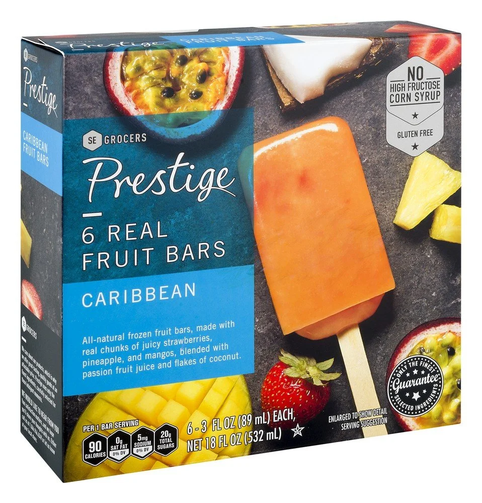
This example of the current packaging helps explain why things needed to change. Moving away from the dark moody packaging to a simpler, friendlier packaging. Hierarchy was one of the first things we agreed to change. Also, a lighter color scheme creates a more welcoming packaging leading shoppers to pick it up off the shelf. The shift in packaging will brighten the store, and ultimately boost sales.
The current packaging has the product image on the front. The conceptual design has it on the back—causing the item to become more interactive. Most shoppers that purchase private label goods are familiar with the brand and do not need the image to accompany product name. Which allowed my team to feel comfortable not including imagery on the front.


